Plotting data at the channel and source level
Introduction
To visualize your data you can use FieldTrip’s high-level plotting functions, which are optimized for the FT data structures. Like other high-level functions they take a cfg as first input argument, followed by the data. These functions take care of all bookkeeping and some of the functions allow you to interact with the data by clicking in the figure.
Alternatively, you can use the low-level FieldTrip plotting functions. These are located in the plotting sub-directory and are named ft_plot_xxx. You can find them by typing in the command window help ft_plot_ and then press the Tab key.
Of course you can also use the standard MATLAB functions like plot, plot3, image, imagesc, patch, surface, etc.
Background
The goal of the plotting functions in FieldTrip is to ease the visualization of complex data structures with multiple dimensions and with data that is not trivial to interpret spatially. This is accomplished with high-level functions (e.g., ft_topoplotER or ft_multiplotTFR) and low-level functions (with prefixes ‘ft_plot_*’ and ‘ft_select_*’, e.g., ft_plot_matrix or ft_select_box). For more simple data, such as a set of reaction times of the subject, we expect you to use the standard MATLAB plotting functions.
The high-level functions take care of the data bookkeeping and call the low-level function. If you want to make more complex figures or tweak all options, you can bypass the high-level functions and call the low-level functions instead. This is especially useful if there is no data selection and bookkeeping involved, e.g., when you want to plot multiple geometrical objects (like sensors, source model, head surface, etc).
To determine which high-level functions are suitable for you depends on the type of data you have: sensor or source space data. In this tutorial we assume that you already have the data from the event-related averaging tutorial, the time-frequency representations of power tutorial and the applying beamforming techniques in the frequency domain tutorial, and we will demonstrate plotting at both the sensor and source level.
Let us start by loading some data.
cd /home/common/matlab/fieldtrip/data/ftp/tutorial/plotting/
load avgFC.mat
load GA_FC.mat
load TFRhann.mat
load statERF.mat
load statTFR.mat
load sourceDiff.mat
Plotting data at the channel level
Data at the channel level has a value for each sensor (MEG) or electrode (EEG). Those values can change over time and/or over frequency.
Singleplot functions
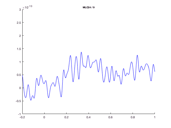
With ft_singleplotER you can make a plot using the avgFC data from the ERF tutorial by the following code.
The ft_singleplotER function first selects the data to be plotted, in this case channel MLC24, from -0.2 to 1.0 seconds. Subsequently this selected data is plotted with the MATLAB plot function.
cfg = [];
cfg.xlim = [-0.2 1.0];
cfg.ylim = [-1e-13 3e-13];
cfg.channel = 'MLC24';
figure; ft_singleplotER(cfg,avgFC);
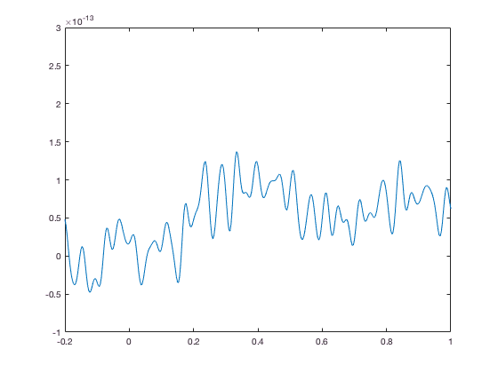
You could make the same plot by the following code, using the MATLAB plot command.
selected_data = avgFC.avg(9,241:601); % MLC24 is the 9th channel, -0.2 to 1.0 is sample 241 to 601
selected_time = avgFC.time(241:601);
figure;
plot(selected_time, selected_data)
xlim([-0.2 1.0])
ylim([-1e-13 3e-13])
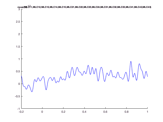
The advantage of ft_singleplotER is that it does the bookeeping for you. e.g., you can plot the mean over all MLC channels, which are MEG channels over left-central region
cfg = [];
cfg.xlim = [-0.2 1.0];
cfg.ylim = [-1e-13 3e-13];
cfg.channel = 'MLC*';
figure; ft_singleplotER(cfg,avgFC);
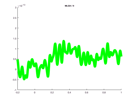
and change the line width or colo
cfg = [];
cfg.xlim = [-0.2 1.0];
cfg.ylim = [-1e-13 3e-13];
cfg.channel = 'MLC24';
cfg.linewidth = 10;
cfg.linecolor = 'g';
figure; ft_singleplotER(cfg,avgFC);
The ft_singleplotER function might not look so impressive compared to standard plot; that is because the ERF data representation is quite simple.
The advantage of using the standard MATLAB plot function is that you can easily find all documentation for it (“doc plot”) and tweak the low-level figure characteristics.
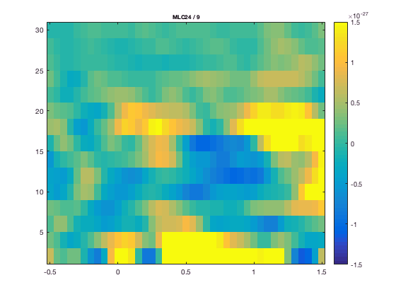
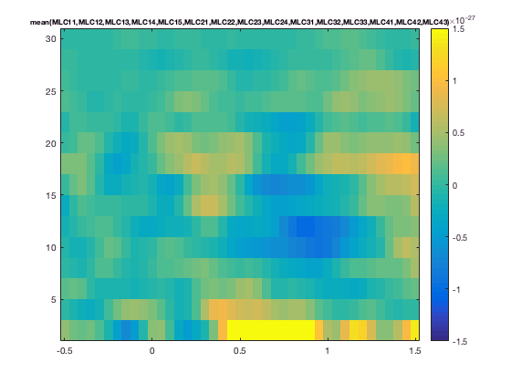
The FieldTrip plotting functions have a lot of built-in intelligence to make plotting of multidimensional data easier. It is for instance possible to do baseline correction before plotting, by specifying the baseline type and time limits. In the plotting functions either the FieldTrip function ft_timelockbaseline or ft_freqbaseline is called. If you specify multiple channels in cfg.channel both singleplot functions will plot the mean over these channels. In the plotting functions the FieldTrip function ft_channelselection is called, which makes it straightforward to plot for instance the mean TFR (download here, see time-frequency analysis tutorial)of the left central channels.
cfg = [];
cfg.baseline = [-0.5 -0.1];
cfg.baselinetype = 'absolute';
cfg.zlim = [-1.5e-27 1.5e-27];
cfg.channel = 'MLC24'; % top figure
figure; ft_singleplotTFR(cfg, TFRhann);
or with the average over a group of channel
cfg.channel  = 'MLC*' % bottom figure
figure; ft_singleplotTFR(cfg,TFRhann);
You can again make very similar figures using standard MATLAB plotting functions.
chanindx = find(strcmp(TFRhann.label, 'MLC24'));
figure; imagesc(squeeze(TFRhann.powspctrm(chanindx,:,:)));
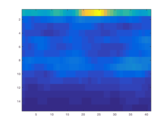
The default MATLAB image is shown upside down compared to usual MEG/EEG conventions. Along the axes you can see the number of time and frequency bins, but not the acqual time and frequency. This can be fixed of course.
figure; imagesc(TFRhann.time, TFRhann. freq, squeeze(TFRhann.powspctrm(chanindx,:,:)));
axis xy % flip vertically
colorbar
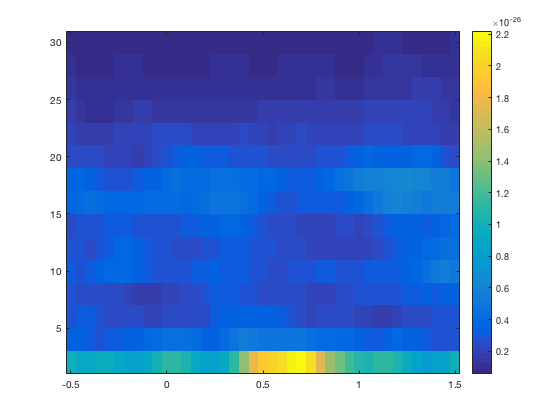
Still, the power is more difficult to interpret due to it being larger for low frequencies and smaller for high frequencies. This 1/f characteristic is removed from the figure by baseline correction. See also ft_freqbaseline.
Multiplot functions
The multiplot functions work similarly to the singleplot functions, again first by selecting the data and subsequently using the MATLAB functions plot and imagesc. But instead of one plot, multiple plots are made; one for each channel. These plots are arranged according to a specified layout in one pair of axes.
There is a separate tutorial that explains how to specify the channel layout for plotting.
In the subsequent figures you can see these axes that are normally set to “off”.
cfg = [];
cfg.layout = 'CTF151.lay';
figure; ft_multiplotER(cfg, avgFC);
axis on % this shows the actual MATLAB axes
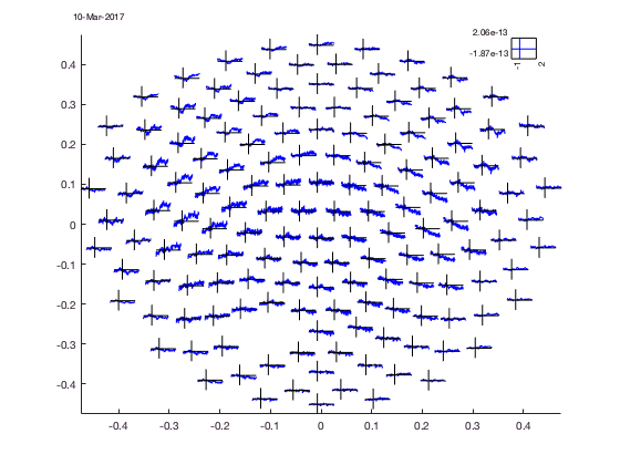
Normally the axes of the figure are not visible, only the “axis” of each channel, but remember these are not real axes on which you can use MATLAB axis commands, the are just lines drawn by the function. Of course you can set the limits of the channel “axis” by the cfg structure (cfg.xlim, cfg.ylim).
cfg = [];
cfg.baseline = [-0.5 -0.1];
cfg.zlim = [-3e-27 3e-27];
cfg.baselinetype = 'absolute';
cfg.layout = 'CTF151.lay';
figure; ft_multiplotTFR(cfg,TFRhann);
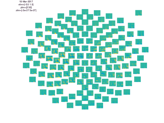
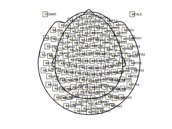
In the upper left corner you see the “COMMENT” element and in the upper right cornier you see the “SCALE” element. The scale contains the average of all channels.
The location of all channels and the COMMENT and SCALE placeholder can be visualized with
cfg = [];
cfg.layout = 'CTF151.lay';
cfg.layout = ft_prepare_layout(cfg);
reading layout from file CTF151.lay
the call to "ft_prepare_layout" took 0 seconds and required the additional allocation of an estimated 1 MB
figure; ft_plot_layout(cfg.layout);
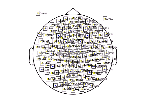
Note that the layout contains all 151 MEG channels; the one channel missing in the data is automatically excluded from the plots.
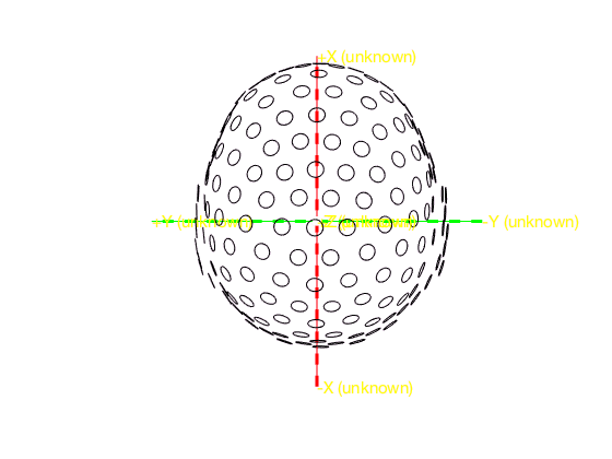
All channels are squeezed in a circle and the nose and ears are indicated at the top and sides. The actual 3-D layout of the MEG channels in the CTF system is more complex than the circular arrangement suggested by the flat 2-D layout. This is a generic challenge for projections onto a 2-D plane and also applies to cartography. We can plot the bottom coil of the CTF gradiometer channels with
figure;
ft_plot_sens(avgFC.grad, 'chantype', 'meggrad')
ft_plot_axes(avgFC.grad)
view(-90, 90) % you should rotate the figure to get a good 3-D feel of the channel locations.
Although many tutorials elsewhere on the FieldTrip website are using the standard CTF151 layout, we do have another one that better reflects the helmet shap
cfg = [];
cfg.layout = 'CTF151_helmet.mat'; % note that it is a binary .mat file, not an ASCII .lay file
cfg.layout = ft_prepare_layout(cfg);
reading layout from file CTF151_helmet.mat
the call to "ft_prepare_layout" took 0 seconds and required the additional allocation of an estimated 4 MB
figure; ft_plot_layout(cfg.layout);
The layout is determined by the layout file. Read more on layout files here, and in the frequently asked questions.
For multiplotting planar gradient data from the Neuromag/Elekta/MEGIN system it is especially relevant to understand the layout files. The Neuromag system has two planar gradiometers and one axial magnetometer at each sensor location. You do not want to plot those on top of each other. Hence the Neuromag layout files contain two (for the old 122 channel system) or three (for the recent 306 channel systems) separate subplots for each channel location. Those two (or three) subplots hold the data for the two planar gradients and for the magnetometer signal.
cfg = [];
cfg.layout = 'neuromag306all.lay';
cfg.layout = ft_prepare_layout(cfg);
reading layout from file neuromag306all.lay
the call to "ft_prepare_layout" took 0 seconds and required the additional allocation of an estimated 7 MB
figure; ft_plot_layout(cfg.layout);
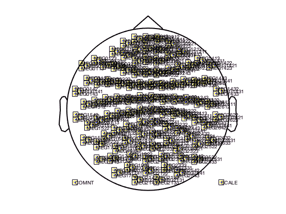
You should zoom in on the figure to see the triplets for the three channels ar each sensor locations. There are also template layouts available that only contain the magnetometer channels at the correct location (i.e. not shifted) and that contain the combined planar channels. The latter one can be used after applying ft_combineplanar on your data.
Topoplot functions
ft_topoplotER and ft_topoplotTFR plot the topographic distribution of 2-Dimensional or 3-Dimensional datatypes as a 2-D circular view (looking down at the top of the head). The arrangement of the channels is again specified in the layout (see above in multiplot functions). The ft_topoplotER and ft_topoplotTFR functions first again select the data to be plotted from the 2D or 3D input data and subsequently plot the selected data using low-level FieldTrip functions. Using one value for each channel and the x and y coordinates, the values between points are interpolated and plotted.
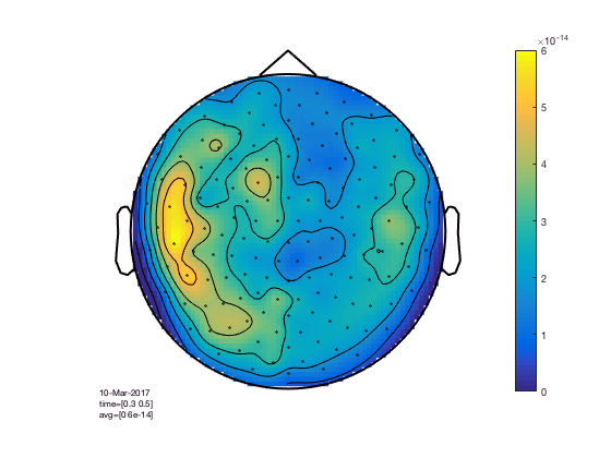
cfg = [];
cfg.xlim = [0.3 0.5];
cfg.zlim = [0 6e-14];
cfg.layout = 'CTF151.lay';
cfg.parameter = 'individual'; % the default 'avg' is not present in the data
figure; ft_topoplotER(cfg,GA_FC); colorbar
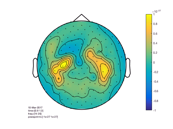
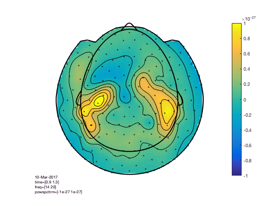
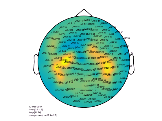
cfg = [];
cfg.xlim = [0.9 1.3];
cfg.ylim = [15 20];
cfg.zlim = [-1e-27 1e-27];
cfg.baseline = [-0.5 -0.1];
cfg.baselinetype = 'absolute';
cfg.layout = 'CTF151.lay';
figure; ft_topoplotTFR(cfg,TFRhann); colorbar
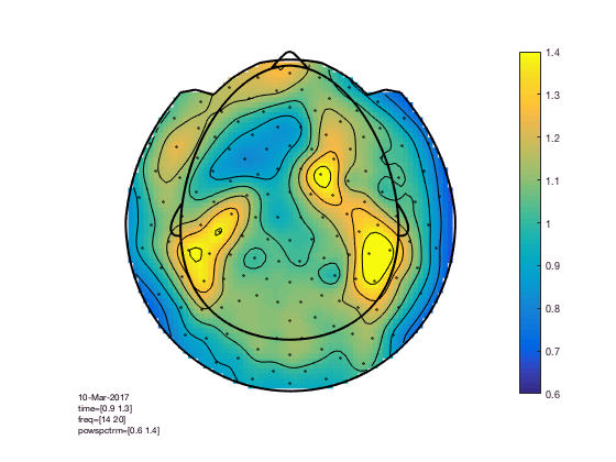
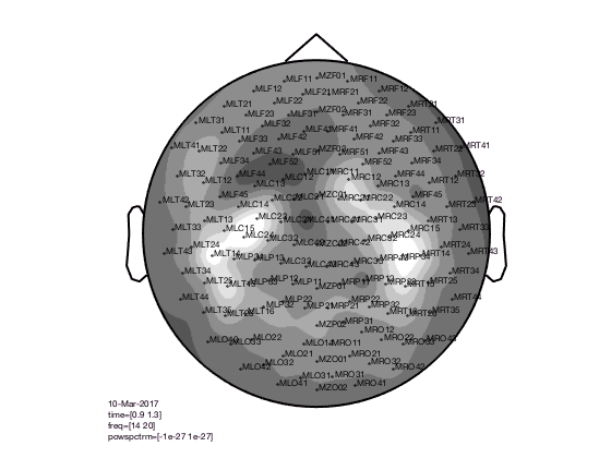
You can compare this to the more realistic helmet-style layout, which better acknowledges the fact that the MEG channels extend below the ears and that the helmet has sort of an opening at the face.
cfg = [];
cfg.xlim = [0.9 1.3];
cfg.ylim = [15 20];
cfg.zlim = [-1e-27 1e-27]; % this is in T^2
cfg.baseline = [-0.5 -0.1];
cfg.baselinetype = 'absolute';
cfg.layout = 'CTF151_helmet';
figure; ft_topoplotTFR(cfg,TFRhann); colorbar
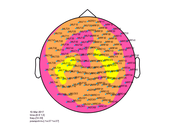
The baseline correction computes the power difference compared to the pre-stimulus baseline. We can also look at the power ratio
cfg = [];
cfg.xlim = [0.9 1.3];
cfg.ylim = [15 20];
cfg.zlim = [0.6 1.4]; % the value 1 means 100%, so this ranges from 60% to 140% of the baseline power
cfg.baseline = [-0.5 -0.1];
cfg.baselinetype = 'relative';
cfg.layout = 'CTF151_helmet';
figure; ft_topoplotTFR(cfg,TFRhann); colorbar
The interpretation becomes more clear with a different colormap
cfg = [];
cfg.xlim = [0.9 1.3];
cfg.ylim = [15 20];
cfg.zlim = [0.6 1.4]; % the value 1 means 100%, so this ranges from 60% to 140% of the baseline power
cfg.baseline = [-0.5 -0.1];
cfg.baselinetype = 'relative';
cfg.layout = 'CTF151_helmet';
cfg.colormap = '*RdBu';
figure; ft_topoplotTFR(cfg,TFRhann); colorbar
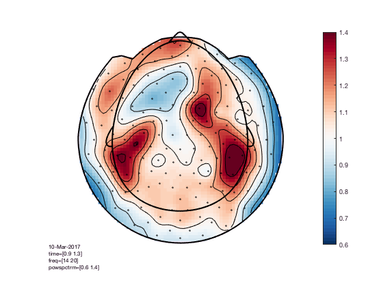
See http://colorbrewer2.org for more details, or read Crameri et al 2020, The misuse of colour in science communication.
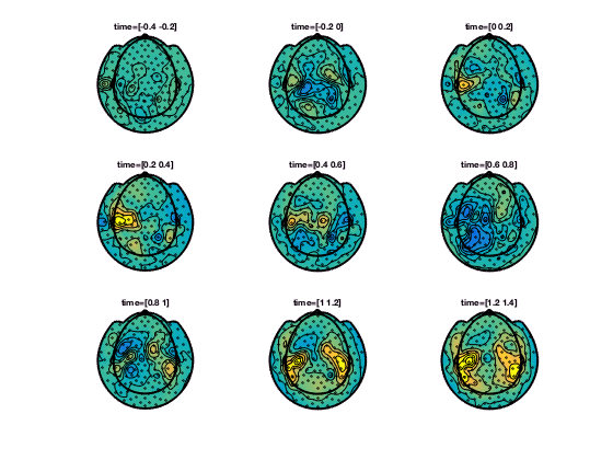
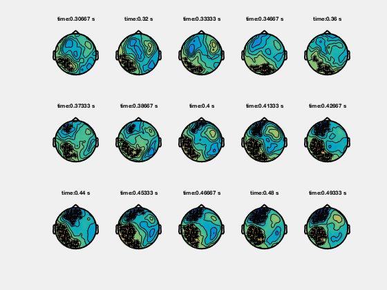
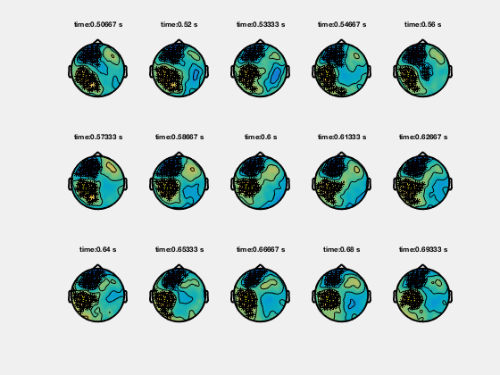
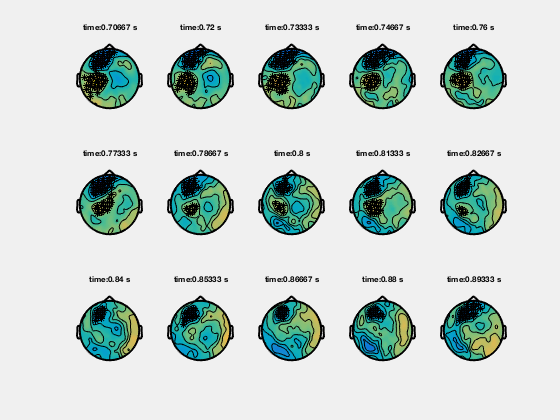
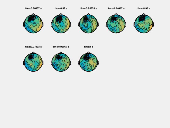
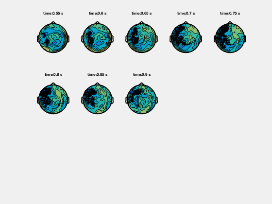
In the help of ft_topoplotER and ft_topoplotTFR you can find many cfg options. For instance by specifying the cfg.xlim as a vector the functions makes selections of multiple time-windows and plots them as a series of subplots.
% for the multiple plots also
cfg = [];
cfg.xlim = [-0.4:0.2:1.4];
cfg.ylim = [15 20];
cfg.zlim = [-1e-27 1e-27];
cfg.baseline = [-0.5 -0.1];
cfg.baselinetype = 'absolute';
cfg.layout = 'CTF151_helmet.mat';
cfg.comment = 'xlim';
cfg.commentpos = 'title';
figure; ft_topoplotTFR(cfg,TFRhann);
In ft_topoplotER and ft_topoplotTFR, you can specify many options to fully control the appearance of the picture. Subsequently you can use the MATLAB print function to write the figure to a file. Preferred file formats are EPS for vector drawings that can be edited in Adobe Illustrator or in Canvas (using “print -depsc”) or .png for bitmaps (using “print -dpng”).
To make the EPS-files optimally suitable for Adobe Illustrator, use the command “print -depsc -adobecs -painter”.
Since MATLAB uses the ‘painter’ renderer to export in Illustrator format, this method allows one to export quite complex figures that otherwise would be exported as bitmaps. Note, however, that the ‘painter’ renderer also has certain limitations compared to the z-buffer and openGL renderers. (See also MATLAB help on selecting a renderer).
Some examples of what you can do
% options for data selection (used with any plotting function
cfg = [];
cfg.xlim = [0.9 1.3];
cfg.ylim = [15 20];
cfg.zlim = [-1e-27 1e-27];
cfg.baseline = [-0.5 -0.1];
cfg.baselinetype = 'absolute';
cfg.layout = 'CTF151.lay';
Options specific to the topoplot
cfg.gridscale = 300;
cfg.style = 'straight';
cfg.marker = 'labels';
figure; ft_topoplotTFR(cfg,TFRhann);
cfg.gridscale = 300;
cfg.contournum = 10;
cfg.colormap = gray(10);
figure; ft_topoplotTFR(cfg,TFRhann);
cfg.gridscale = 300;
cfg.contournum = 4;
cfg.colormap = spring(4);
cfg.markersymbol  = '.';
cfg.markersize = 12;
cfg.markercolor = [0 0.69 0.94];
figure; ft_topoplotTFR(cfg,TFRhann);
Interactive mode
During the phase of the analysis in which you do a lot of data inspection, you can use the interactive modus to go from one plot to the other. You can for instance select a certain frequency and time range in a singleplot, to get the average over that range plotted in a topoplot. Or select a group of channels in a topoplot or a multiplot and get the average over those channels for the whole time and frequency range in a single plot.
% interactive
cfg = [];
cfg.baseline = [-0.5 -0.1];
cfg.zlim = [-3e-27 3e-27];
cfg.baselinetype = 'absolute';
cfg.layout = 'CTF151.lay';
cfg.interactive = 'yes';
figure; ft_multiplotTFR(cfg,TFRhann);

You should select channels using the mouse and click, then you get a singleplot average over those channels. You should select a time-frequency window and click, then you get topoplot average over that time-frequency window.
Plotting clusters
Ft_clusterplot plots a series of topoplots that highlight the clusters from cluster-based permutation testing. The output “stat” is 2D data from ft_timelockstatistics or ft_freqstatistics with cfg.correctm=’cluster’.
The function automatically finds the clusters in the data which are smaller than the pre-specified threshold (cfg.alpha) and plots a series of topoplots with the data in “stat” field (are for instance t-values) and the sensors which are part of the cluster highlighted.
Stat should be 2D, i.e. channels-by-time, or channels-by frequency. You cannot visualize channels-by-frequency-by-time, that case requires either averaging over time, or averaging over frequency.
Although the code below shows how to visualize clusters, you should be cautious on how to interpret clusters.
Clusters in timelocked data
% clusterplot
cfg = [];
cfg.zlim = [-6 6]; % T-values
cfg.alpha = 0.05;
cfg.layout = 'CTF151.lay';
ft_clusterplot(cfg,statERF);
Clusters in time-frequency data
% clusterplot
cfg = [];
cfg.zlim = [-5 5];
cfg.alpha = 0.05;
cfg.layout = 'CTF151.lay';
ft_clusterplot(cfg,statTFR);
Plotting channel-level connectivity
This is possible using ft_connectivityplot, ft_multiplotCC and ft_topoplotCC.
Plotting Principal or Independent Components (PCA/ICA)
To plot PCA, ICA or other decompositions that result from ft_componentanalysis you can use ft_topoplotIC for the topographies and ft_databrowser for the topographies combined with the time series. For a viewer that displays the power spectrum, topography and variance over time of each component, see ft_icabrowser.
Plotting data at the source level
With the ft_sourceplot function you can plot functional source reconstructed data. Data structures can be source estimates from ft_sourceanalysis or ft_sourcegrandaverage or statistical values from ft_sourcestatistics. The following sections will present the available options for source-level plotting, following the same structure as previous sections.
In visualising source reconstructed data, you should consider that there are two principled ways of representing the spatial dimension of source reconstructed data:
-
On a regular, 3-dimensional grid, i.e. volumetric data like an MRI scan
-
On a surface geometry, i.e. a cortical sheet.
Besides the three dimensions that describe the spatial or geometrical aspect of source reconstructed brain activity, the data can have additional dimensions for time and/or frequency.
Volumetric data
Source level data is considered volumetric if the locations at which activity is estimated are spaced in a regular 3-dimensional grid, like voxels in an MRI. FieldTrip offers multiple plotting options for volumetric data that can be specified in the cfg for ft_sourceplot.
You can (1) make multiple 2D axials slices throughout the brain on which the functional data is plotted, (2) create three slices in each of the three orthogonal directions (axial, sagittal and coronal) on which you can click around to navigate the whole the brain (3) project the functional data onto a surface and make a 3-D rendering of that.
Let us first provide the basic code to use one of these plotting methods, using the data from Subject01 from the beamformer tutorial. Later on, we will give more details on the configuration options for ft_sourceplot.
Individual anatomical MRI (prior to spatial normalization)
% load MRI, reslice it and interpolate the low-res functional data onto the high-res anatomy
mri = ft_read_mri('Subject01.mri');

cfg = [];
mri = ft_volumereslice(cfg, mri);

cfg            = [];
cfg.downsample = 2;
cfg.parameter  = 'pow';
sourceDiffInt  = ft_sourceinterpolate(cfg, sourceDiff , mri);

% spatially normalize the anatomy and functional data to MNI coordinates
cfg = [];
cfg.nonlinear = 'no';
sourceDiffIntNorm = ft_volumenormalise(cfg, sourceDiffInt);

% plot multiple 2D axial slices
cfg = [];
cfg.method        = 'slice';
cfg.funparameter  = 'pow';
cfg.maskparameter = cfg.funparameter;
cfg.funcolorlim   = [0.0 1.2];
cfg.opacitylim    = [0.0 1.2];
cfg.opacitymap    = 'rampup';
ft_sourceplot(cfg, sourceDiffInt);
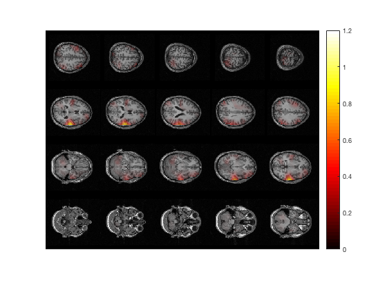
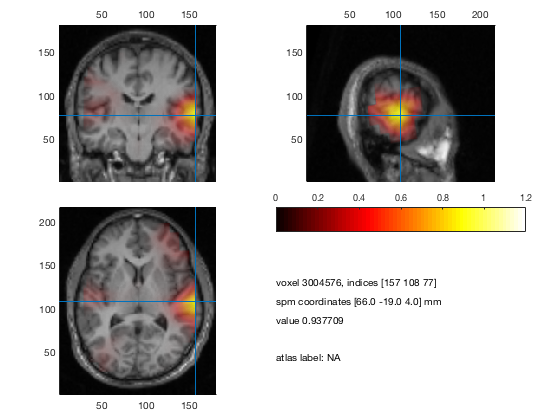
% idem, in MNI (or SPM) coordinates
ft_sourceplot(cfg, sourceDiffIntNorm);
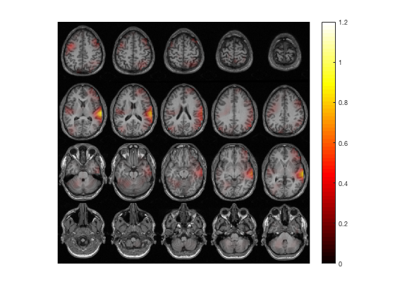
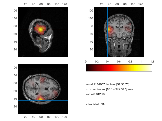
% plot 3 orthogonal slices
cfg = [];
cfg.method        = 'ortho';
cfg.funparameter  = 'pow';
cfg.maskparameter = cfg.funparameter;
cfg.funcolorlim   = [0.0 1.2];
cfg.opacitylim    = [0.0 1.2];
cfg.opacitymap    = 'rampup';
ft_sourceplot(cfg, sourceDiffInt);
% idem, in MNI (or SPM) coordinates
ft_sourceplot(cfg, sourceDiffIntNorm);
The three essential cfg parameters ar
-
cfg.anaparameter the anatomy parameter, specifying the anatomy to be plotted
-
cfg.funparameter the functional parameter, specifying the functional data to be plotted
-
cfg.maskparameter the mask parameter, specifying the parameter to be used to mask the functional data
All data that is used in the figure (anatomical, functional, mask) must be interpolated and represented onto the same grid. See ft_sourceinterpolate and ft_volumenormalise.
the anatomical parameter
The anatomy can be read with ft_read_mri. The functional data can be interpolated onto the anatomy by ft_sourceinterpolate. The anatomy is scaled between 0 and 1 and plotted in gray scale.
the functional parameter
The functional data is plotted in color optionally on top of the anatomy. The colors used can be determined by cfg.colormap (see MATLAB function COLORMAP). How the functional values are assigned to the colormap is determined by cfg.colorlim. It makes sense to plot for instance source data as functional parameter, but also statistical values (for instance T-values).
the masking parameter
You can control the opacity of the functional data by the mask parameter. Which values are plotted opaque and which transparent is determined by cfg.opacitymap and cfg.opacitylim (see MATLAB function ALPHA and ALPHAMAP). The opacity map determines the degree of opacity of the functional data going from opaque to transparent. There are multiple ways to determine your opacity scale, as a user you can determine the opacity values for each and every single voxel (and as such, region of interest). As such, the opacity limits determine how the opacity map is assigned to the values of the mask parameter.
Example 1: Plotting only positive values
Imagine that your functional data has values ranging from -3 to 3. Here we plot only the positive values (‘zeromax’), using the scale whereby the strongest values are opaque, and the values close to zero are transparent
cfg.maskparameter = cfg.funparameter
cfg.colorlim      = [0 3] % or 'zeromax'
cfg.opacitymap    = 'rampup'
cfg.opacitylim    = [0 3] % or 'zeromax'
Example 2: Plotting high absolute values
Suppose the functional data is the same as in example 1, but now we only wants to plot the high negative values and high positive values (using ‘maxabs’). We set these high absolute values to opaque, and the values around zero to transparent
cfg.maskparameter = cfg.funparameter
cfg.colorlim      = [-3 3] % or 'maxabs'
cfg.opacitymap    = 'vdown'
cfg.opacitylim    = [-3 3] % or 'maxabs'
Example 3: Masking voxels outside values of interest
Here, we make a field in the data with an opacity value for each voxel, and apply that as your mask. For instance if you only want to plot the values between 2 and 2.5 you can specify
data.mask         = (data.fun>2 & data.fun<2.5)
cfg.maskparameter = 'mask'
Plotting on a brain surface
Scalar data per vertex
The representation of source activity on a surface results from source estimation using a cortical sheet as the source model. The cortical sheet is represented as a triangulated surface and the activity is assigned to each of the vertices, i.e. corner points of the triangles. Besides doing the source estimation on a cortical sheet, it is also possible to interpolate the volumetric data (i.e. estimated on a regular 3-D grid) onto a cortical sheet for visualization.
Scalar data (e.g., time-averaged activity, frequency-specific power estimates, statistics, etc.) can be plotted using the ft_plot_mesh function. Alternatively, volumetric data can also be rendered on a surface by projecting it to a surface geometry, using ft_sourceplot. An example of the latter is given below, where we use the same data as in the preceding section.
Project volumetric data to an MNI white-matter surface surface
cfg = [];
cfg.method         = 'surface';
cfg.funparameter   = 'pow';
cfg.maskparameter  = cfg.funparameter;
cfg.funcolorlim    = [0.0 1.2];
cfg.funcolormap    = 'jet';
cfg.opacitylim     = [0.0 1.2];
cfg.opacitymap     = 'rampup';
cfg.projmethod     = 'nearest';
cfg.surffile       = 'surface_white_both.mat'; % Cortical sheet from canonical MNI brain
cfg.surfdownsample = 10;  % downsample to speed up processing
ft_sourceplot(cfg, sourceDiffIntNorm);
view ([90 0])             % rotate the object in the view
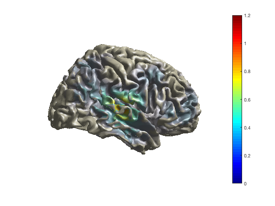
If you enable the camera toolbar (menu option “view”, “camera toolbar”) you have more options for controlling the 3-dimensional rendering, e.g., change perspective, change the position of the light (used for reflection and shadows).
As with the channel-level multiplots, you can change the colormap that maps the functional values on the colors.
ft_sourceplot(cfg, sourceDiffIntNorm);
colormap jet
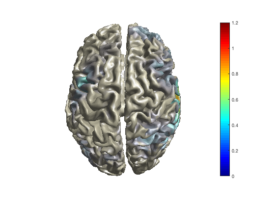
ft_sourceplot(cfg, sourceDiffIntNorm);
colormap hot
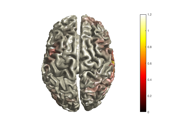
ft_sourceplot(cfg, sourceDiffIntNorm);
colormap cool
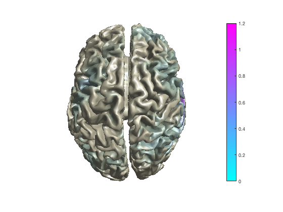
If you right-click with the mouse on the colorbar in the figure, you can also do this interactively.
To interactively explore higher-dimensional data (such as TFR data) on the surface, ft_sourceplot cannot be used. You can make selections of a specific time and/or frequency and make a series of subplots.
Higher dimensional source-level data
Since source-level function data requires three dimensions for “space” and uses the color dimension for “strength”, there is no graphical dimension in which the temporal evolution or the spectral distribution can be visualized in full detail. The ft_sourceplot function allows you with method=ortho to use the lower right corner of the figure to show the timecourse or spectrum of the functional activity at a specific location (the one you click). The ft_sourcemovie function allows you to use time (as in a movie) to explore the changes of cortical activity over time and/or frequency.
Using external tools
Although MATLAB is a very flexible development and analysis environment, it is not super-fast in visualization. Hence external visualization tools are sometimes more useful for exploring your data.
Volumetric and surface based data can be exported to standard file formats using ft_sourcewrite. Subsequently, you can use external tools such as
For geometrical data, such as segmented anatomical MRIs, triangulated surfaces, or tessellated meshes, you can use
For time-series data for which you otherwise would use ft_databrowser, you can use
More general approaches for visualisation of data are
Suggested further reading
Plotting channel-level data in a 2-dimensional representation on your flat computer screen or on paper requires that the 3-dimensional channel positions are mapped or projected onto the 2-dimensional plane. The tutorial on specifying the channel layout for plotting explains how this mapping is constructed.
Frequently asked question
- Which colormaps are supported?
- How can I define neighbouring sensors?
- How can I use the databrowser?
- How do I construct a layout file for the plotting functions?
- I am getting strange artifacts in figures that use opacity
- I am having problems printing figures that use opacity
- What is the format of the layout file which is used for plotting?
Example script